The John East Project
Blue note? I’ll get my coat. This one designed itself..
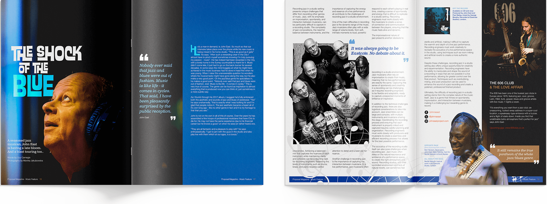
I was tasked with a website design and build along with album artwork for John East and his unfairly talented troupe. Once again I found myself in my element. When you’re singing from the same hymn sheet, not only do you sing in unison but you always know what’s coming next. Who knew Jazz could be on the menu though? A seamless process made this an absolute pleasure to work on and I really hope he gets the success he deserves (providing I’m permitted to be involved in future releases of course)
Blue Monday to Friday
Having a wide-open brief such as I was afforded is design heaven. Furthermore, I immediately had a look and feel for the band’s identity in mind. It needed to evoke a certain period rather than pretend to be anything else, but not appear painfully retro. An carefully interlocking typeface was just the ticket, and in simple monochrome, it meant it could lend itself to any colour scheme should the need arise in the future.A go-to wingman online
With no immediate plans for a further release, the website design could take all it needed from the record sleeve and reflect the moody but playful identity John East had cultured with his band of merry men. What really mattered was hopefully in the hands of listeners. Although the website was to offer teaser tracks and general information, it served primarily as a source for upcoming gigs and a place to book your seat.Onwards & uploads
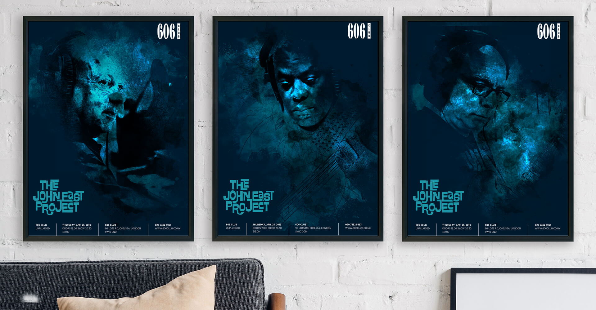
Pressing and printing an album usually means touring for a band, which meant moving things in a slightly different direction. For promotional material I felt we could afford to go beyond the Blue Note feel and add something a little more modern to reflect the energy and movement of the music and musicians, even if it was at the expense of the angular order of artwork so far. If someone saw a poster advertising a gig, we wanted it look like a gig tomorrow night and not necesarrily from 1959. Using a blend of the monochrome imagery, freehand sketching and some ‘painterly’ techniques, we were able to create some uniform posters unique to each band member. When we get feedback from the punters, we’ll then act accordingly!

“I just love it. Everything feels right and from the feedback I get, I’m not the only one. We spent a lot of time getting the music right; Guy made the CD and album look right.”
John EastThe John East Project
Tagged Portfolio Home
